Composition is a crucial factor in any image. But it's always been hard to determine and describe precisely what makes good composition good, and bad ones bad. I've thought about how to clarify the subject, by relating it to how the human visual system operates. If you have any feedback I'd appreciate it.
Terminology: Sight is our most important sense, by far. Certain visuals (like some 60's Op-Art) can cause severe discomfort, headache, nausea, even trigger epileptic fits. Lack of visual stimulus becomes painful after a certain time, to the point that the brain desperately invents visuals of its own to fill the void. There is a definite link between visuals and our physical well-being; we should be fully aware of it, and utilize it.
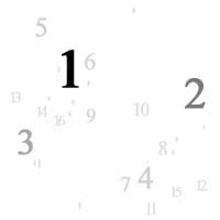
The following images are small due to bandwidth
restrictions, they should be viewed larger to
obtain the full effect - I suggest full screen and a
fairly close viewing distance.
As an image it fails to hold our attention for very
long, partly due to its lack of meaning, but also
because it soon becomes annoying, tiresome to look
at. (Soon as measured in minutes, not
seconds.)
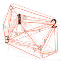
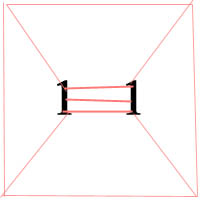
They become 'caught' in the center, hardly venturing
outside at all - there just isn't anything there to
'stick to'. And if the eyes do leave the
center, they stay glued to the edges and corners of
the image. This is uncomfortable. Even worse - this configuration will quickly tire the eyes. (Try it; enlarge it and look at it intently for a minute or two.) Six similar foci are almost as bad, as you can see on the right. In fact the more the worse, seems to be the rule.
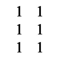
But even better is lowering the amplitude of one focus, making it less important and 'attractive' to the eye. The visual cortex is now freer to direct the eye around the image along different paths, which is obviously less tiring. Let's add more.
Here's one of many possible configurations that are
close to ideal, according to these guidelines:
Note that the last image has a very natural and
aesthetic feeling to it, and even though it's nothing
but numbers it's easy to look at for a longer time.
(Try the same experiment as above, enlarge it and look
at it for a minute or so; you'll definitely not feel the
same discomfort as with the other one.) Now to apply this to some real images.
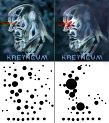
On the left an image with many nearly equal foci
distributed quite homogenously - this creates an
uninteresting composition. (Not sure who the artist is, if you know please contact me.)
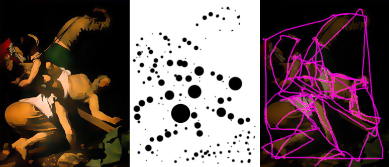
Below - a famous painting by a true master of composition, stylized to show up the contrasts better. The schematics give us clues as to why this image has such a pleasing composition; it seems to follow the guidelines perfectly.
Of course there is more to composition than this, but
the guidelines can be quite helpful as a starting point.
Balance
Another aspect of composition is the concept of
'balance'. An image can be perceived as heavier on
one side than the other - or perhaps top-heavy.
If so then it's perceived as off-balance, usually an
un-desirable effect.
Color Be very careful with strong colors - fully saturated colors should be kept to a minimum. This goes double for CG, where the artist often thinks that a bright red car should be shaded 100% red - but this is wrong. Using the eye-dropper tool in Photoshop on a photo will reveal the truth (max between 50-80% for non-incandescent colors).
Following the same guidelines above
concerning contrast, the strongest color should only
cover a few % of the image area, while medium strong
colors can cover more, and the very muted colors (pastel
colors, grays, browns, dark colors etc) should cover
most of the image area.
Golden Mean
|
|||
 Here's
a perfectly symmetrical image, with only two foci,
of exactly similar weight, close together.
(I'm simplifying by only considering contrasts
in size, shape and value.)
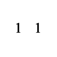
Here's
a perfectly symmetrical image, with only two foci,
of exactly similar weight, close together.
(I'm simplifying by only considering contrasts
in size, shape and value.) 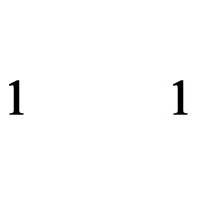
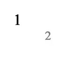
 But
how about moving the 2 foci further apart, to lead
the eye around more real estate?
But
how about moving the 2 foci further apart, to lead
the eye around more real estate?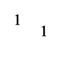
 So
let's try something else. Maybe 2 slanted?
A little bit better - now the eye goes in a triangle
between the foci and and the bottom left corner
(mostly).
So
let's try something else. Maybe 2 slanted?
A little bit better - now the eye goes in a triangle
between the foci and and the bottom left corner
(mostly).